


We built this theme for people pulling long shifts. The high-end dark mode is easy on the eyes, while the HUD-style layout keeps complicated customer data simple and quick to read at a glance.
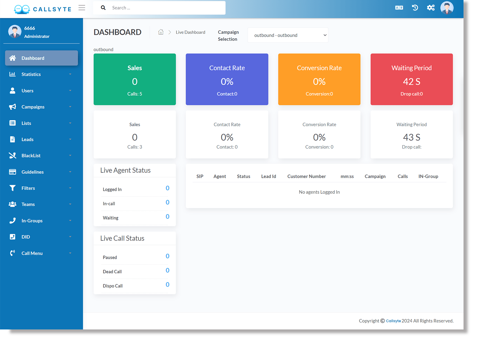
We used a high-end dark mode to make those long night shifts easier on the eyes.
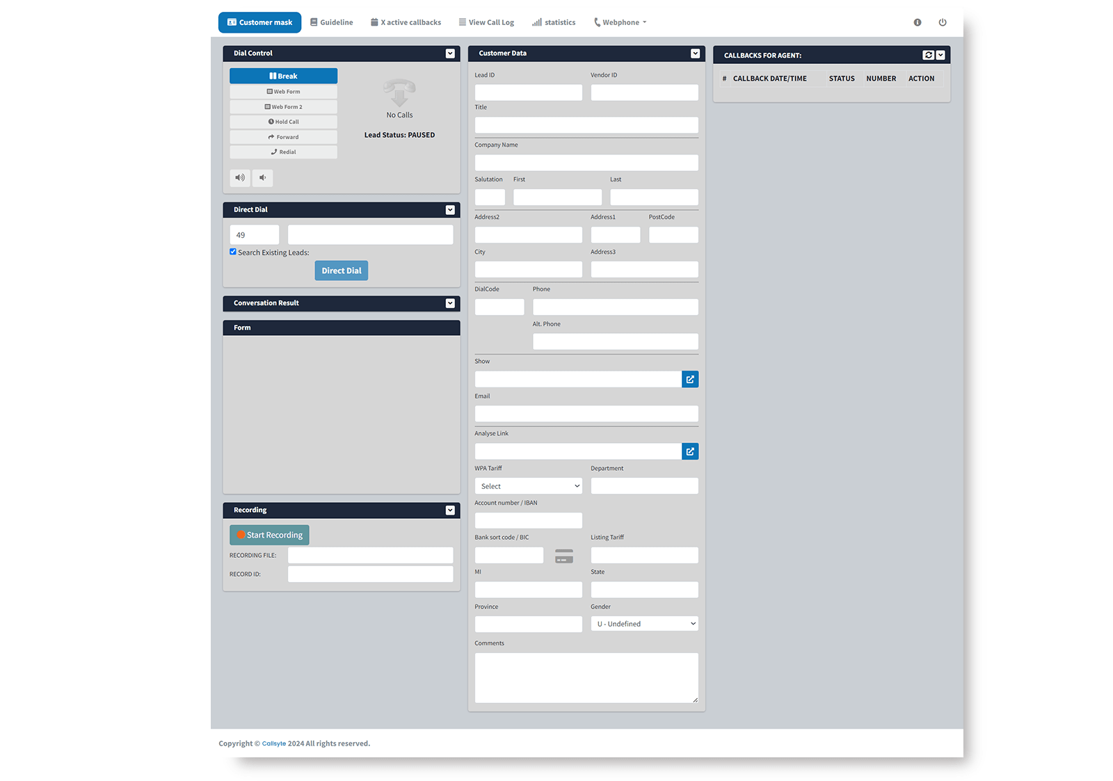
We pull your CRM data right into the main dashboard without cluttering up your call controls.
Your team can move things around to suit their workflow. It’s all about letting agents keep their go-to tools.
It’s designed to be noticed without being a total distraction or hurting your eyes with bright flashes.
A dedicated side-panel for sales scripts that stays synced with the active lead profile.
Our search is built for live calls, scanning your whole database in a snap.
This part focuses on how a better interface actually lowers physical stress for your team. It’s written for operations managers who know that keeping staff happy and comfortable is the best way to stop high turnover.
Long shifts are hard enough on the eyes, so we used a dark theme to cut down on harsh glare and blue light. It’s a small change that makes a huge difference in keeping agents focused and headache-free after eight hours on the clock.
Instead of straining over bright white monitors, our dark mode makes the important numbers jump right off the screen. It lets agents scan through customer profiles way faster than they ever could on a standard interface.
While Theme 2 looks best in dark mode, we can easily add a global switch. This lets each agent pick the look that’s easiest on their eyes throughout the day.
Not at all—the theme is applied via client-side CSS, ensuring that the aesthetic upgrade has zero impact on call routing or database processing speeds.